English
Analyzing Order Data with Charts
The Analytics page displays data related to order status and sales statistics by product type over specific time periods using intuitive visual charts. This allows users to quickly grasp the business performance of their Organization, make comparisons, and adjust business operations accordingly.
On the Analytics page, the system currently displays two different charts:
A chart showing order status
A chart showing the number of items ordered by product type
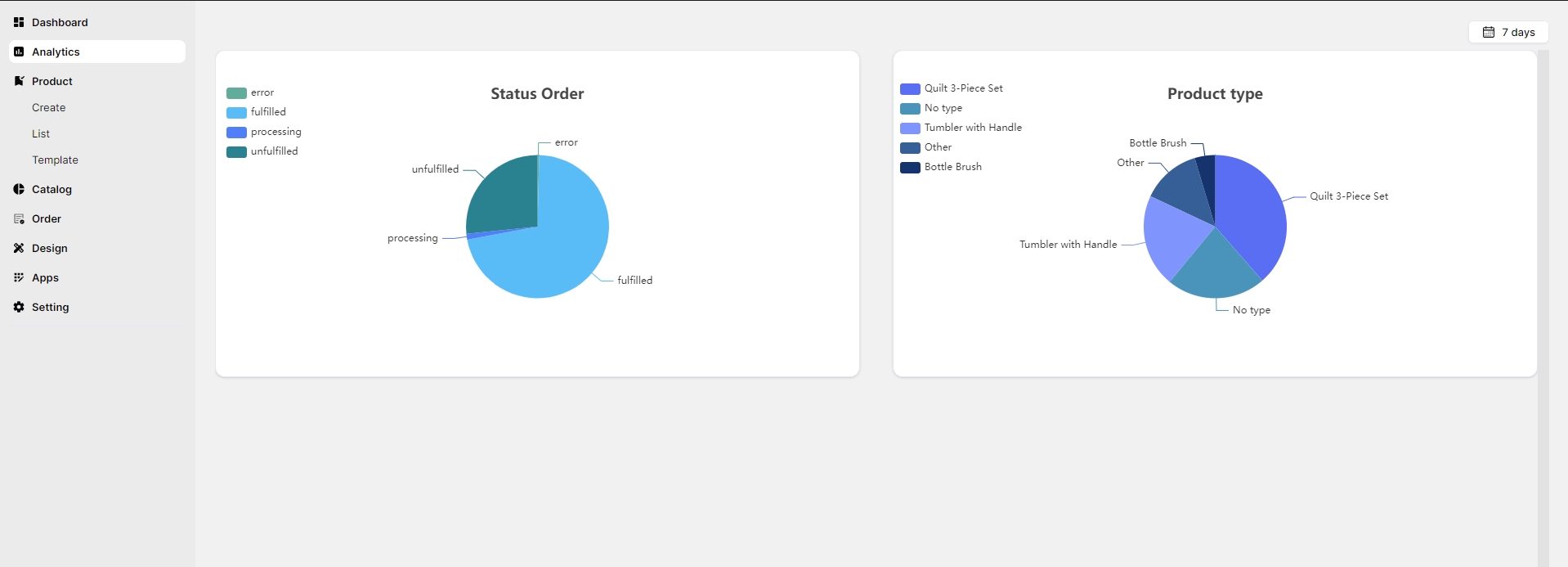
For the Order Status chart, there are four main data fields corresponding to the four order statuses in the system:
- Unfulfilled: not yet produced
- Processing: in progress
- Fulfilled: produced
- Error: has issues
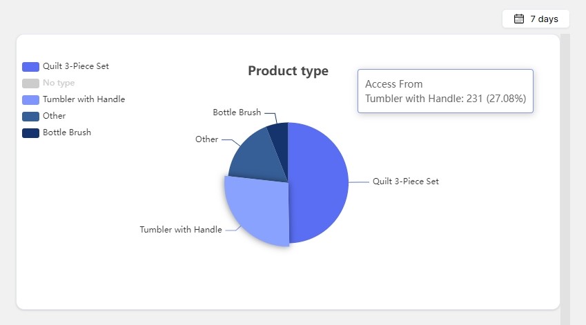
For the Sales by Product Type chart, it displays up to five data fields, corresponding to the four best-selling product types. Products with lower sales volumes are grouped under the Other field.
You can click on each data field in the chart to display the exact number of items along with the corresponding percentage.
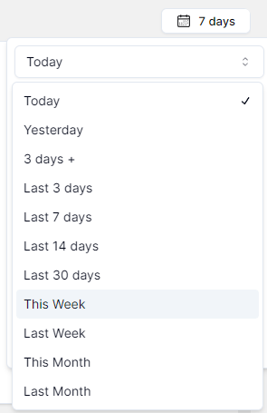
The system supports data analysis over various time ranges. You can click the time filter in the top right corner to select your desired time range.
The charts are automatically updated in real-time, synchronized with the Order page. Any change in order status will immediately affect the data proportions, allowing users to stay up to date with the Organization's operations quickly and accurately.
If you encounter any issues related to the statistical data display on the charts, please contact Inkble’s support team via Telegram or Facebook for assistance.